

The Map That Entered the Conversation
Researching a historic map referenced by Mexico’s President, Dr. Claudia Sheinbaum Pardo, to reaffirm the Gulf of Mexico's long-standing name.

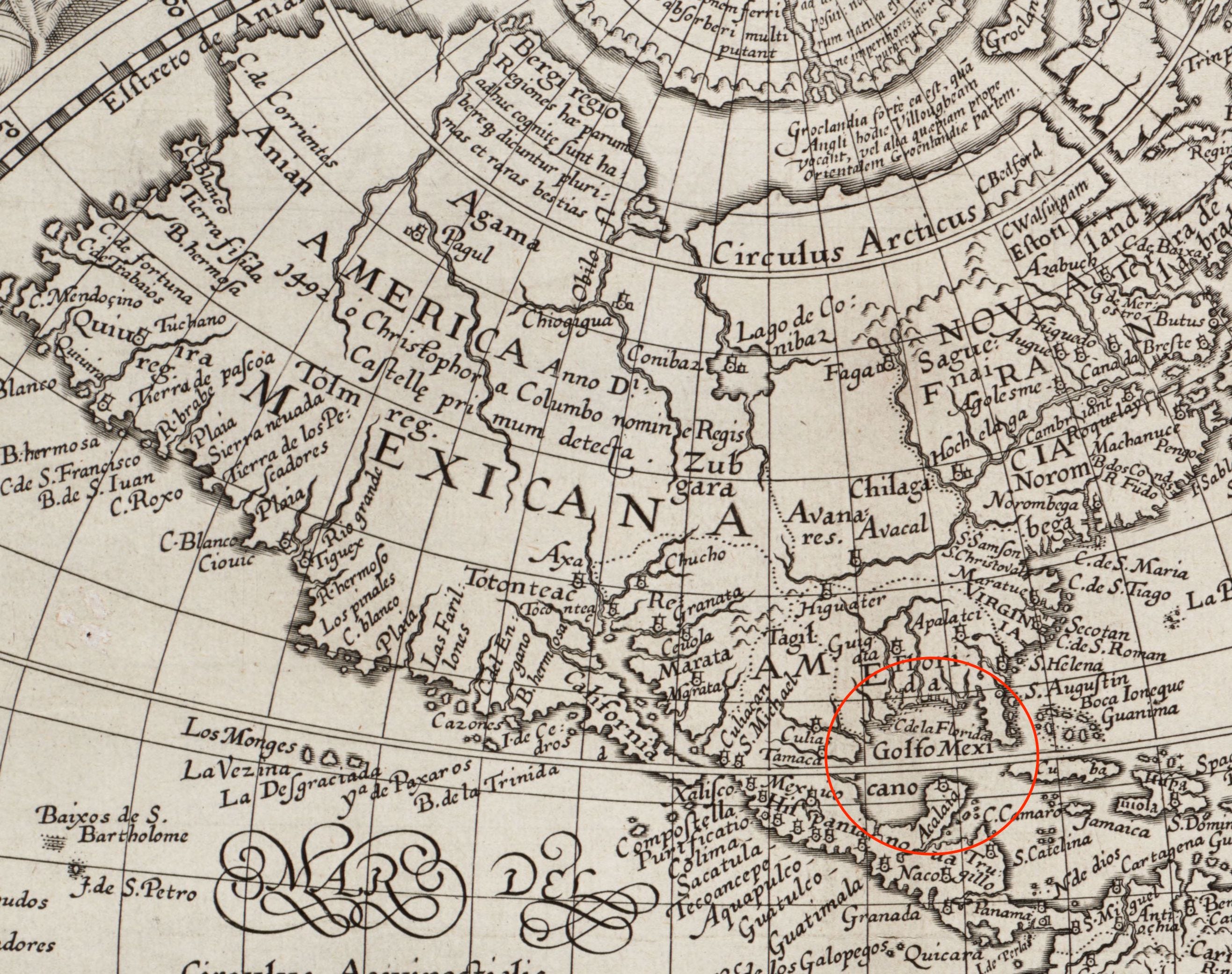
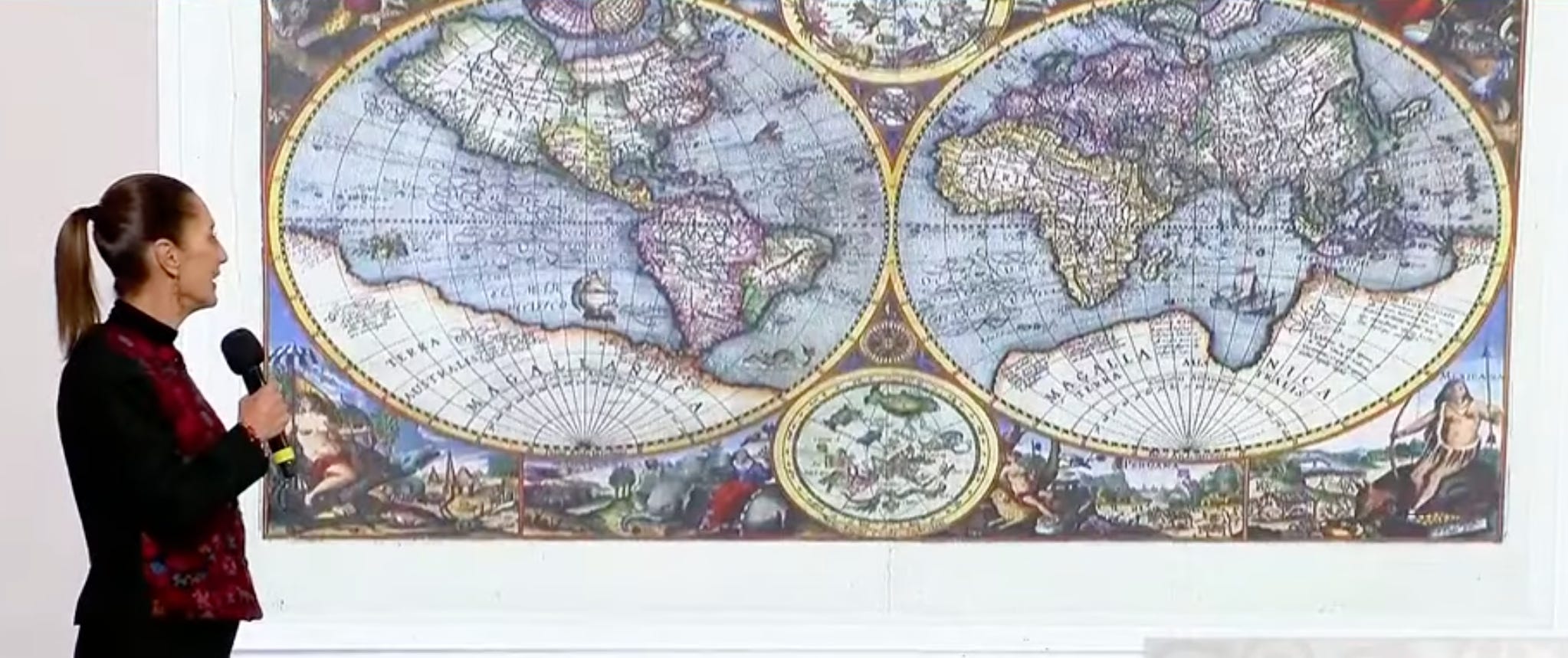
About a month ago, Mexico’s president, Dr. Claudia Sheinbaum Pardo, and her team held their daily news briefing at Mexico City’s Palacio Nacional. At the time, there was chatter that the incoming 47th President of the United States planned to rename the Gulf of Mexico the Gulf of America. In response, her team dedicated part of the briefing to a presentation on the Gulf of Mexico, emphasizing its historically and internationally recognized status as a distinct body of water. They referenced historical sources to reinforce the Gulf’s long-established name, which predates the arrival of the first colonial settlers, including a 1607 world map.
I appreciated their use of historical documents to support the argument that the Gulf of Mexico has borne this name for centuries. Naturally curious, I was drawn to the map and wanted to learn more about it. Though my knowledge of maps is limited, I enjoy examining historical ones because they provide a window into the past and invite comparisons. However, with no background in cartography, I wasn’t sure where to begin. So, I did what most of us do nowadays—I started with a Google search.
The study and practice of making and using maps is called Cartography. Printed maps for navigation were heavily relied upon not long ago, and they are surely still common in some places. The decorative 1607 map shown in the January 8th presentation stands in stark contrast to modern maps, and it's this contrast that makes it so compelling—especially when considering the work that went into its production, including the efforts of the designer, engraver, and printer.
My online search ultimately led me to a reference book called The Mapping of the World: Early Printed World Maps, 1472-1700 by Rodney W. Shirley. Using this book as a reference, along with a (blurry) visual from the January 8th presentation, I identified the map as Orbis Terrarum Typus De Integro Multis In Locis Emendatus auctore Petro Kaerio. Specifically, I was looking for the 1607 edition of the map created by Pieter Van den Keere, although it was originally printed in 1604. I found an uncolored copy that was sold by Sotheby’s in 2014. While I didn’t find the exact map used in the presentation, I did come across a publicly available colored reproduction of the 1607 edition on VintageMaps.com.
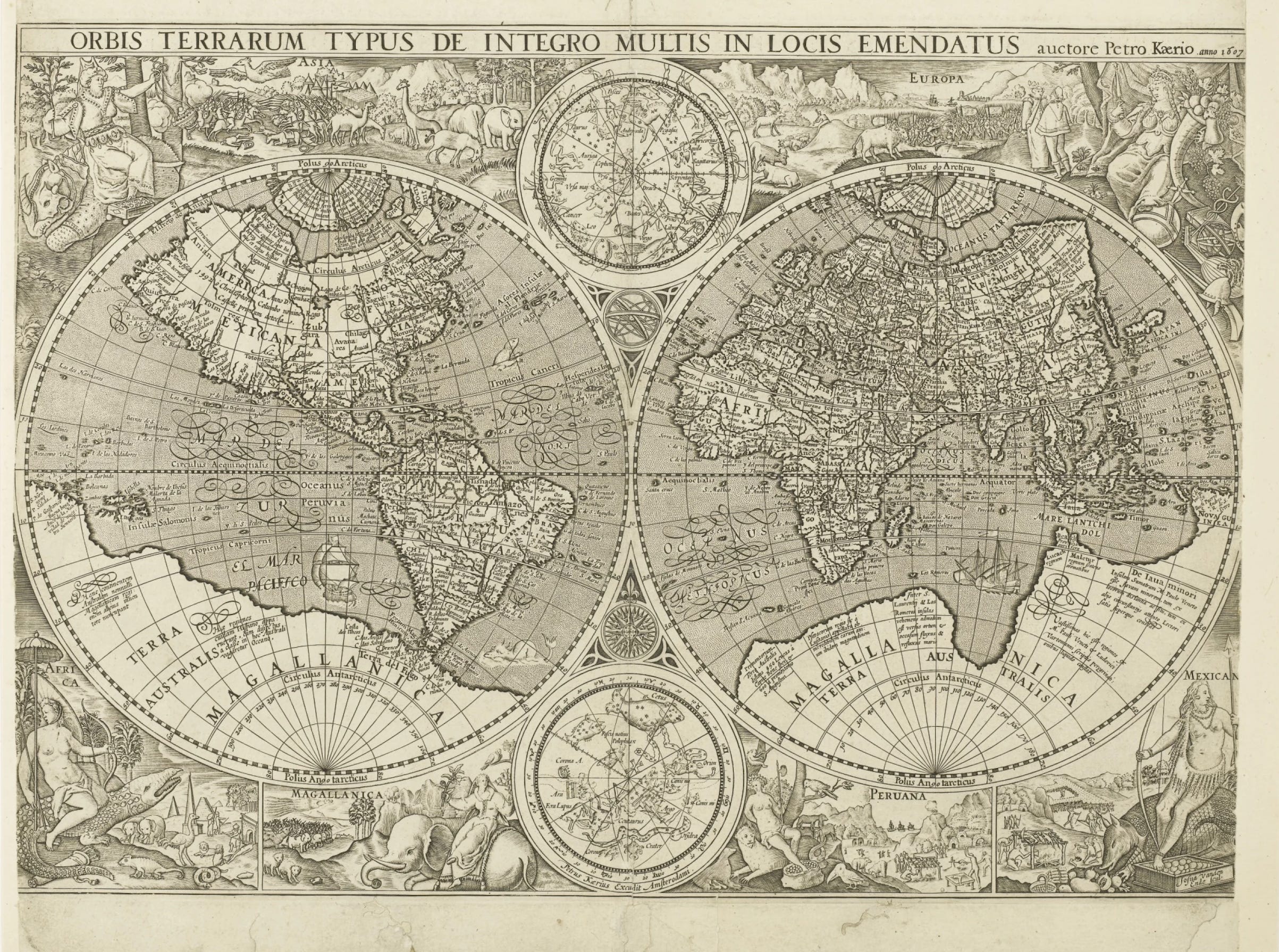
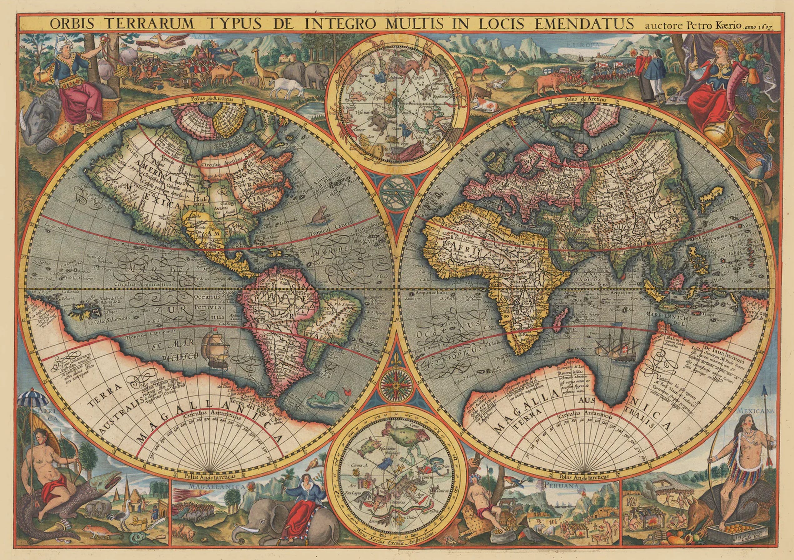
I thought my journey with this map had ended here, but Pieter Van den Keere’s 1607 map is actually an unauthorized reproduction of an earlier published world map. The earlier foundational work was created by Petrus Plancius, a Dutch-Flemish astronomer, geographer, and theologian. Dated 1594, it was titled Orbis Terrarum Typus De Integro Multis In Locis Emendatus auctore Petro Plancio. The engraver, identified in the bottom left corner, was Jan van Doetecum.
The map displays regions of the world depicted by figurative female representations, landscapes from both the Western and Eastern hemispheres (as they were known then), and illustrations of supposed animals indigenous to each area.
At first glance, the 1594 and 1607 maps appear identical, but subtle details set them apart. As Shirley notes (p. 259):
"The same elaborate pictorial borders appear around the two hemispheres, but in this case, the positioning of the scenes representing the continents has been reversed."
In the original 1594 map, Europa and Asia span the top from left to right, while Africa, Magallanica, Peru, and Mexico follow the same arrangement along the bottom.
Compared to Plancius’s earlier maps, this 1594 version included updated geographical details. Shirley observes (p. 207):
"The Far East is more accurately represented. Korea appears as a peninsula for the first time, and Plancius shows an improved outline for Japan, based on drawings by the Portuguese cartographer Luíz Teixeira."
Plancius was among the first cartographers to recognize the value of earlier Portuguese charts. The pictorial borders were also inspired by the works of engraver and publisher Theodore de Bry.
I invite you to explore the differences between the 1594 and 1607 maps below.
Plancius' map left a lasting mark on the work of other cartographers. Subsequent editions were published in 1599 (Latin), 1605, 1614, 1623, and 1644 (Dutch), and in 1610, 1619, and 1638 (French).
With so many editions of the original in circulation, it's easy to see how the pirated 1607 map, which ignited my curiosity, came to be. Who wouldn't be inspired to create their own interpretation?
Reference:
Shirley, Rodney W. The Mapping of the World: Early Printed World Maps, 1472-1700. New Holland Publishers, 1993. Internet Archive, https://archive.org/details/mappingofworldea0000shir/mode/1up.